
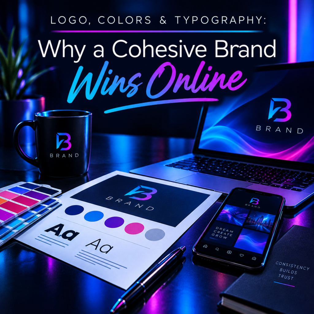
Logo, Colors & Typography: Why a Cohesive Brand Wins Online
Your brand isn't your logo. It's the feeling someone gets the moment they land on your site, open your email, or show up to your event — and whether every one of those moments feels like the same company. That consistency is what we mean by a cohesive brand, and it quietly decides whether people trust you.
What “cohesive branding” actually means
A cohesive brand is a small system working together: your logo, a defined color palette, your typography, your imagery, and the voice you write in. On their own they're just design choices. Used the same way everywhere, they become something people recognize in a split second.
Think of the brands you trust most — you could probably picture their colors and type before their logo. That's cohesion doing its job.
Why it matters more than people think
Recognition compounds. Every time someone sees the same colors and type, the association gets stronger, so your marketing works harder for the same spend. Trust follows recognition: a consistent, polished presence signals that you're established and detail-oriented — and people buy from brands they trust.
And trust converts. Visitors who feel they're in capable hands are far more likely to fill out the form, book the call, or make the purchase. Cohesive branding isn't decoration; it's quietly removing reasons to hesitate.
The hidden cost of an inconsistent brand
When your logo looks different on every page, your blues don't quite match, and three fonts compete for attention, visitors feel it even if they can't name it. The site feels pieced together — and that doubt transfers straight to your product or service. Inconsistency is expensive precisely because it's invisible: you lose conversions you never see.
The core ingredients of a cohesive brand
A strong brand usually comes down to a handful of decisions, documented so everyone applies them the same way: a logo with the variations you'll actually use (light, dark, icon-only); a focused color palette with clear roles and exact values; one or two typefaces with a defined scale for headings and body; and simple usage rules for spacing and placement.
How to get there
Start with a quick audit — pull up your website, social profiles, and any printed material side by side and look for the mismatches. Then define the system, locking your logo, palette, and type into one reference. Finally, apply it everywhere, from your homepage hero down to your email signature. The goal isn't more design; it's the same design, used consistently.
At HMI Multimedia, cohesive branding is step one of how we build. Before a single page goes live, we lock your logo, colors, and typography into a system — so everything that follows feels unmistakably yours.
Start your brand